Project
Year
Client
Location
Team
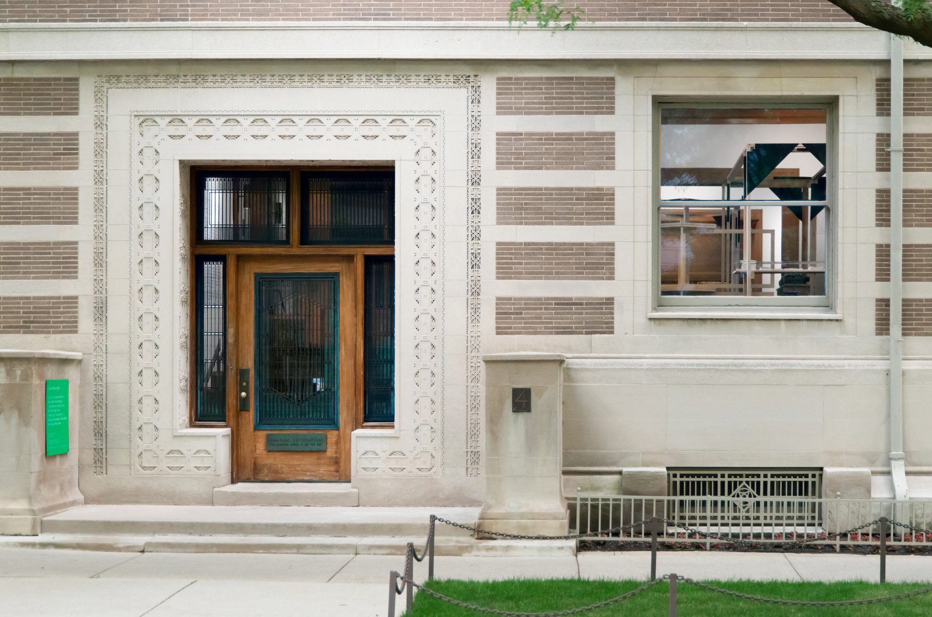
Since 2013, we have worked with the Graham Foundation for Advanced Studies in the Fine Arts on the print and graphic materials to accompany their regular programming that takes place in the historic Madlener House in Gold Coast, Chicago. Continuing our collaboration, we were asked to developed an overarching identity concept for the foundation which would reflect its rich history and provide a consistent visual strategy for future events and graphic material.
Founded in 1956, the Graham Foundation for Advanced Studies in the Fine Arts fosters the development and exchange of diverse and challenging ideas about architecture and its role in the arts, culture, and society. Founded by a bequest from Ernest R. Graham, a prominent Chicago architect, the history of the foundation is strongly intertwined with the history of architecture and publishing in Chicago. When asked to design the identity of the foundation, we aimed to create a strategy that would compliment the well-established institution and nod at its roots in Chicago.
Questioning the process of designing graphic identity for established institutions, we eschewed the need for a logo and proposed an understated logotype based on a new typeface. Taking inspiration from 19th century type producers in Chicago, we developed Graham Gothic, a font that revisits the American tradition of gothic typeface, the precursors of modern sans-serif fonts. Our identity proposal is centered around the Graham Gothic and imagines its use as a logotype, monogram and body text for general communication. Its understated nature also allows for combinations with other typefaces to highlight temporary events, as used on the accompanying postcards, invitations and signs.